Role
UX Researcher / UX Designer
Timeframe
3 Months
Tools
▫️ Miro
▫️ Mural
▫️ Keynote
▫️ Google Forms
▫️ Figma
▫️ Zoom
Summary
Nightinn was a project for my Profesional Diploma in UX Design. My goal was design a native mobile application for a booking hotels company. I set out to create a smooth, stress free hotel booking experience. Through competitive analysis, surveys and a usability testing, I identified key user frustrations like misleading photos, confusing navigation and hidden fees.
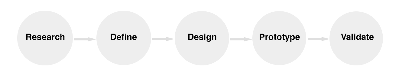
Design Process
My Role
As the solo UX designer, I managed the entire lifecycle of the project, from initial research to the final design. This comprehensive involvement sharpened my skills in building and testing, ensuring I delivered a viable product rooted in a human-centered approach.
Research & Usability test
Online Survey
To better understand user needs, pain points, booking habits, and overall user flows, I conducted an online survey. This provided quantitative insights that complemented my qualitative research and helped validate my initial assumptions about the mobile experience.
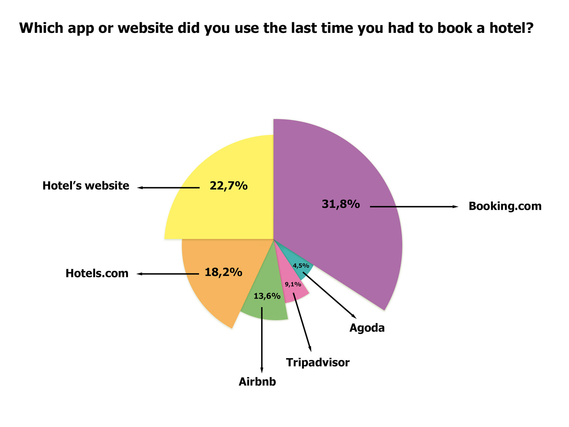
More than 30% of users indicated Booking.com as their preferred booking platform.
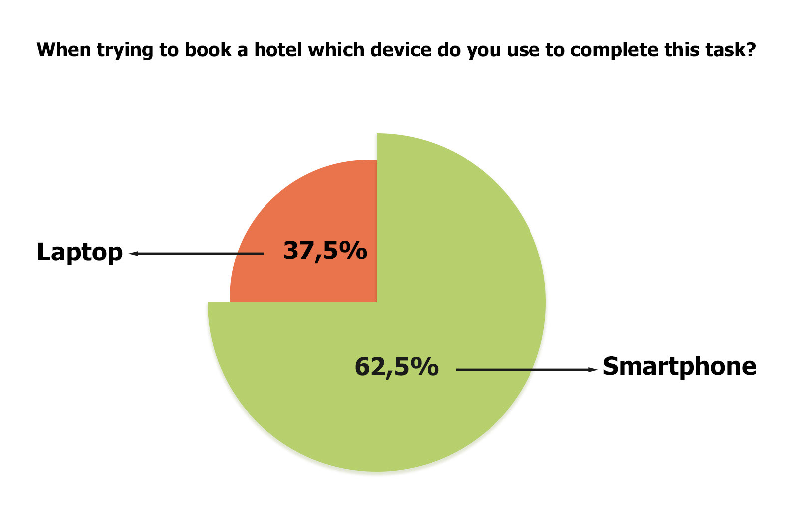
Over 60% of users book hotels on mobile devices.
The survey findings helped me identify and select two companies for the usability test, which in turn prompted three critical questions: Which conventions are essential to follow? Which booking features are apps currently executing well that I could adopt? What gaps or weaknesses could I improve?
Usability test
With my three critical research questions defined, I advanced to the usability testing phase. Through in-depth interviews, I explored how users book hotels on their smartphones, identified pain points, and uncovered opportunities for improvement with questions such as: "What factors do you consider when choosing a hotel?", “How did you book hotel accommodation - online, in a travelling agency, or elsewhere?” and "Tell me about the last time you booked a hotel?"
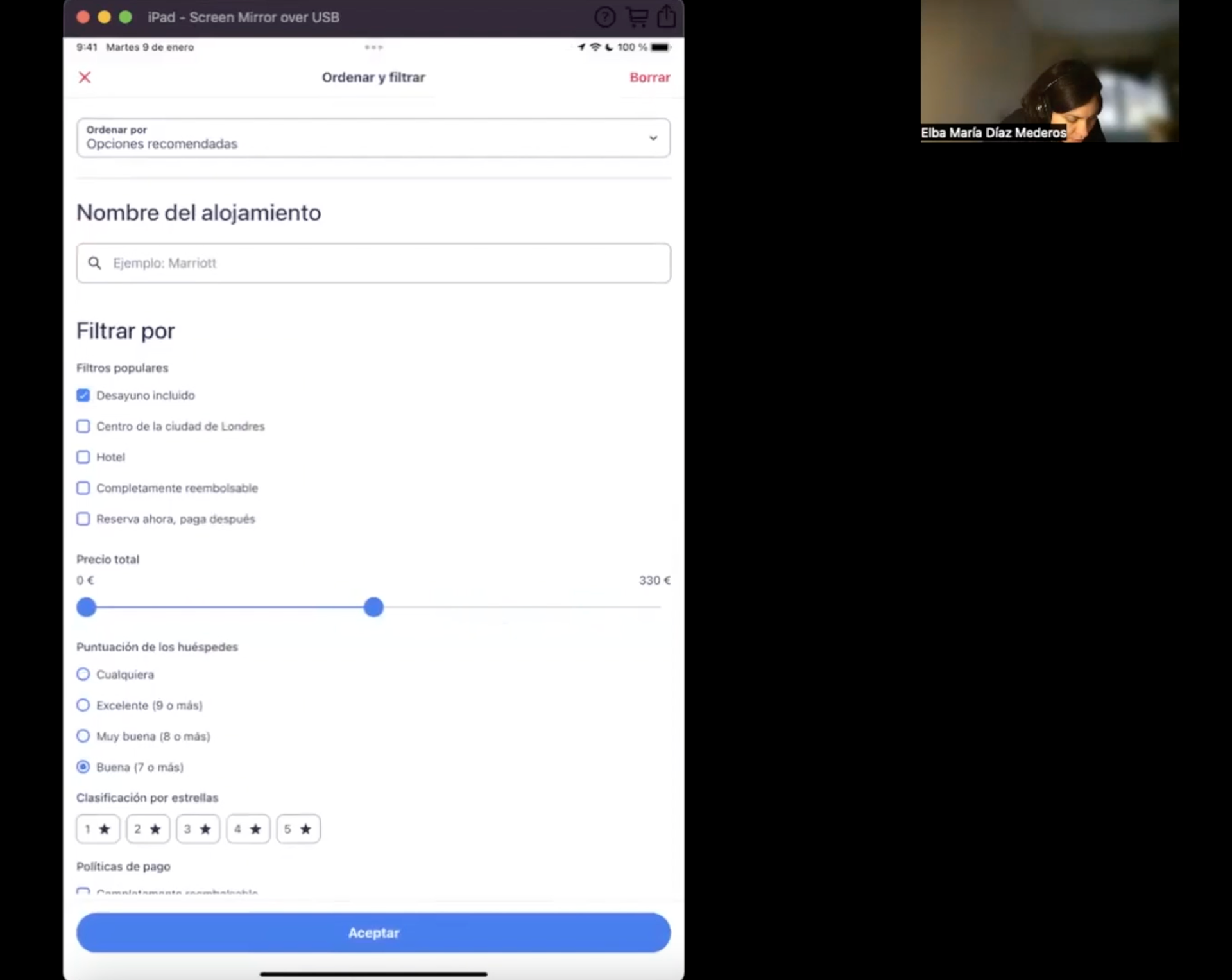
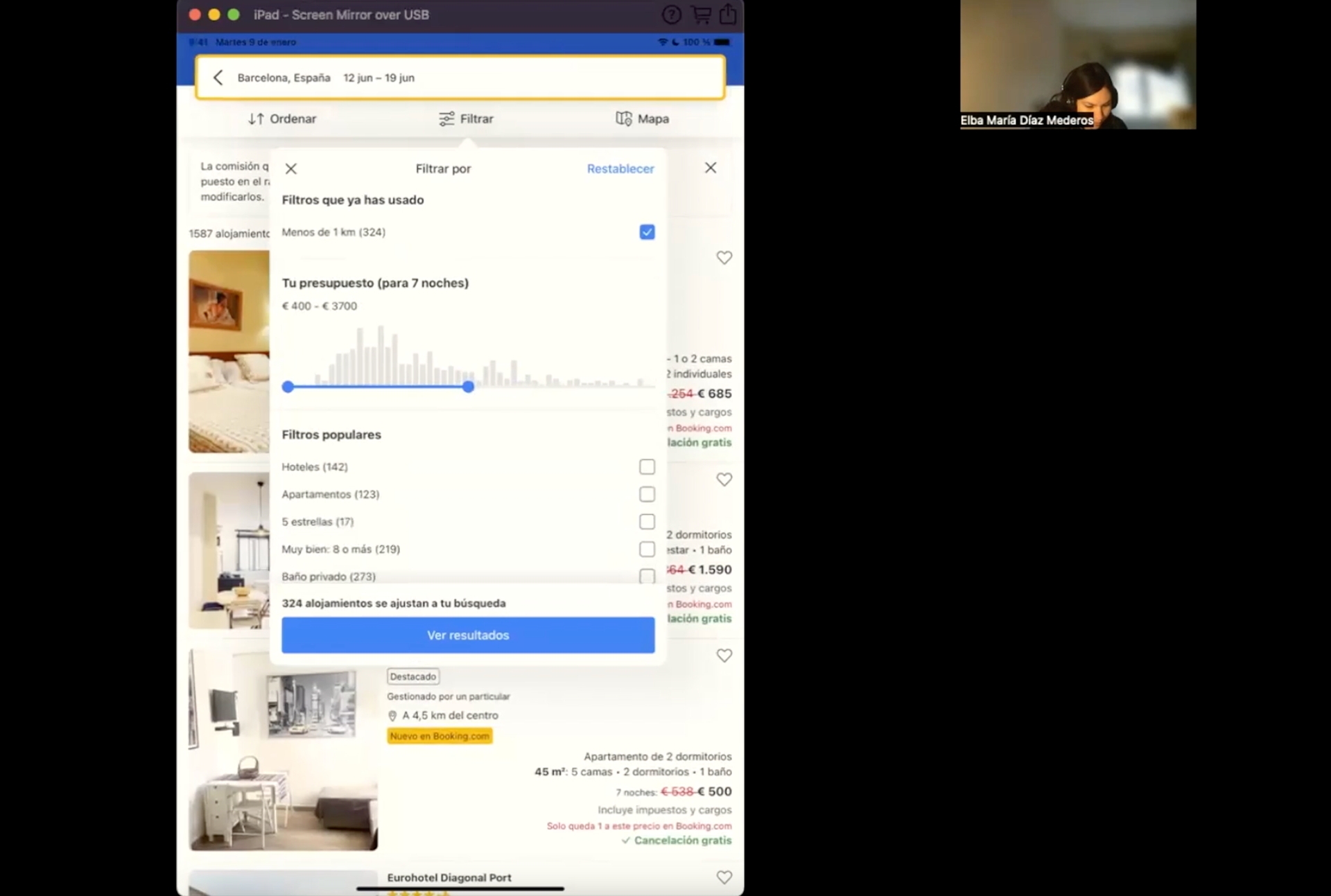
After the interviews, I proceeded to the next stage of testing using the most popular apps identified in the online survey: Booking.com and Hotels.com.
Using a test script with open-ended questions, I asked users to complete specific tasks in both apps. This allowed me to observe and take notes on their navigation flow, reactions, positive interactions and pain points.
A user trying to complete a task on the Hotels.com app
“There's a lot of information actually. About the health and the cleaning, the size, what documentations you need to have, parking, food, accessibility, their policies”
A user trying to complete a task on the Booking.com app
“I can't see where to switch the order to put the lowest price first” “oh! here it is! I have to click on the filters again. Okay, so I'm gonna put the cheapest rooms at the top”
Findings of this session:
Booking.com
While the Booking.com app features an easy-to-use interface compared to its competitor, Hotels.com, users still encountered notable issues:
User Flow Interruptions: The user experienced multiple interruptions during her actions. Confusion with certain icons led her to contact hotels directly for more information.
Lack of Food Information: The user couldn't find an option to view the types of food served by hotels, crucial for her due to dietary restrictions.
Filtering Challenges: The app made it difficult to filter search results. Too many options prevented the user from focusing on her most important criteria. The filter menu was also hard to navigate and unresponsive. The app lagged when filtering hotels by price.
Hotels.com
While the Hotels.com app offers an easy-to-use interface compared to its competitor, Booking.com, several issues emerged during the user's experience:
User Flow Interruptions: The user's actions were frequently interrupted. For example, she had to scroll through the entire calendar to select dates with no flexible dates option. Call-to-action windows also appeared at the beginning, disrupting her flow.
Lack of Date Flexibility: Without a flexible dates option, choosing suitable dates became inconvenient.
Missing Food Information: The app lacked details about the types of food served by hotels. This forced the user to contact hotels directly or visit their official websites.
Filtering Challenges: Filtering results proved difficult. The user couldn't filter by bed options per room. Sorting search results from cheapest to most expensive required returning to the filter menu, a direct option on the search results page would have been more convenient.
Define
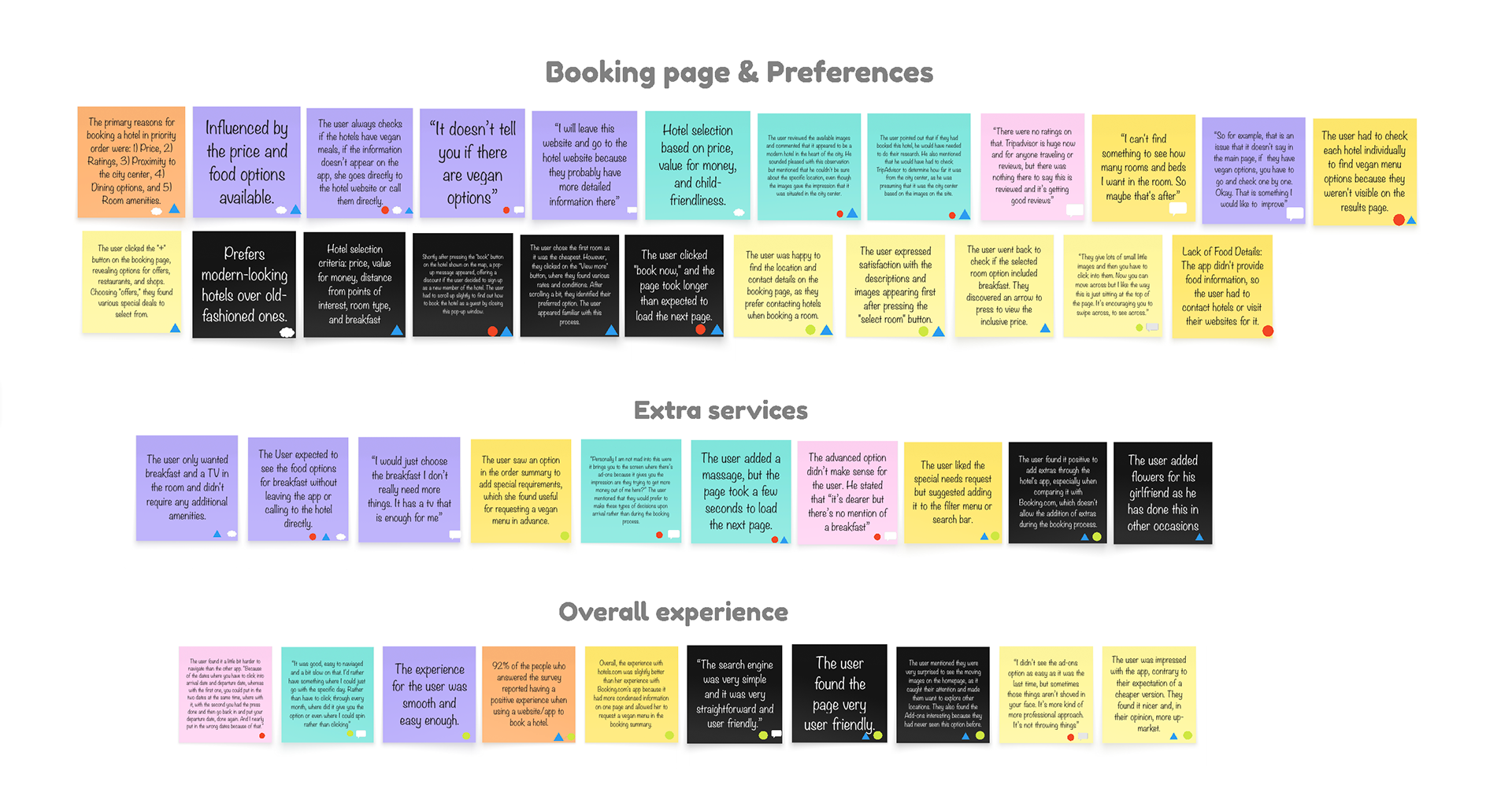
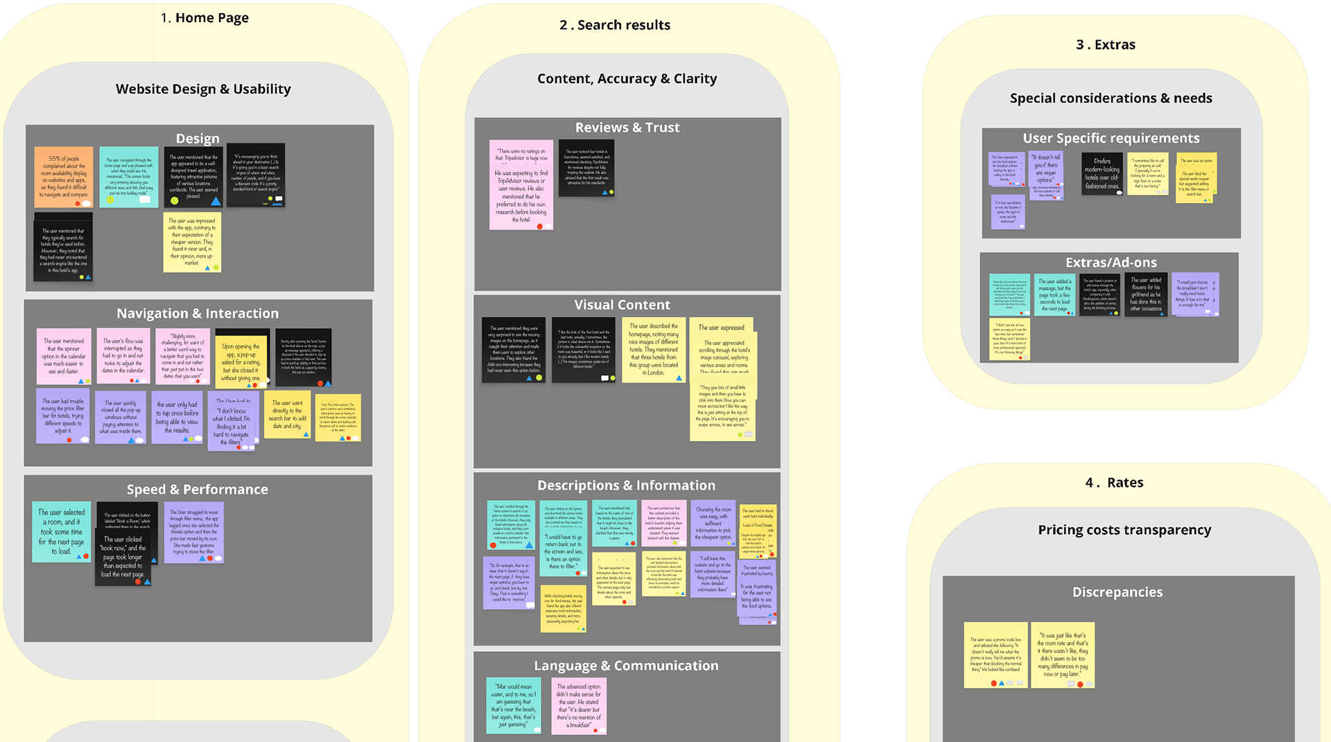
Affinity Diagram
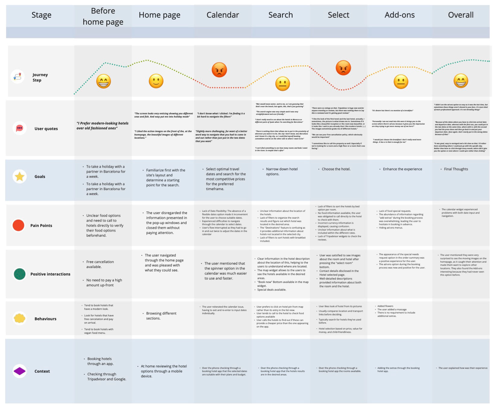
Moving on to the Define stage of my project, I started with an affinity diagram and a customer journey map.
These two steps were crucial, as they allowed me to define the user pain points I needed to address. They also helped clarify the context, user preferences, and features to incorporate into the design of my hotel booking app.
I began by creating the affinity diagram. This helped me gather all the findings from my usability tests and online surveys. I then organised this data into specific categories to gain a clear vision of the insights.
Customer Journey Map
Once I organised the data into a customer journey map, I could visualise the full user experience from start to finish. This let me pinpoint specific pain points and prioritise the solutions that mattered most. It was a crucial step to ensure my design decisions were based on real user needs, not just assumptions.
Design
My primary design goal was to optimise the hotel booking flow by addressing specific user frustrations. Key features include flexible date selection, enhanced filtering, and price transparency. I also prioritised clarity by designing a clear summary of final costs and dates, while displaying detailed amenity information (such as food offerings) directly in the interface.
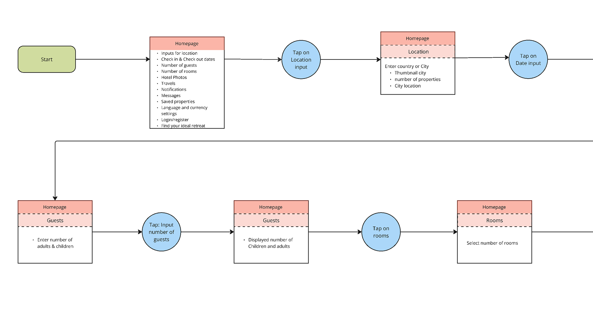
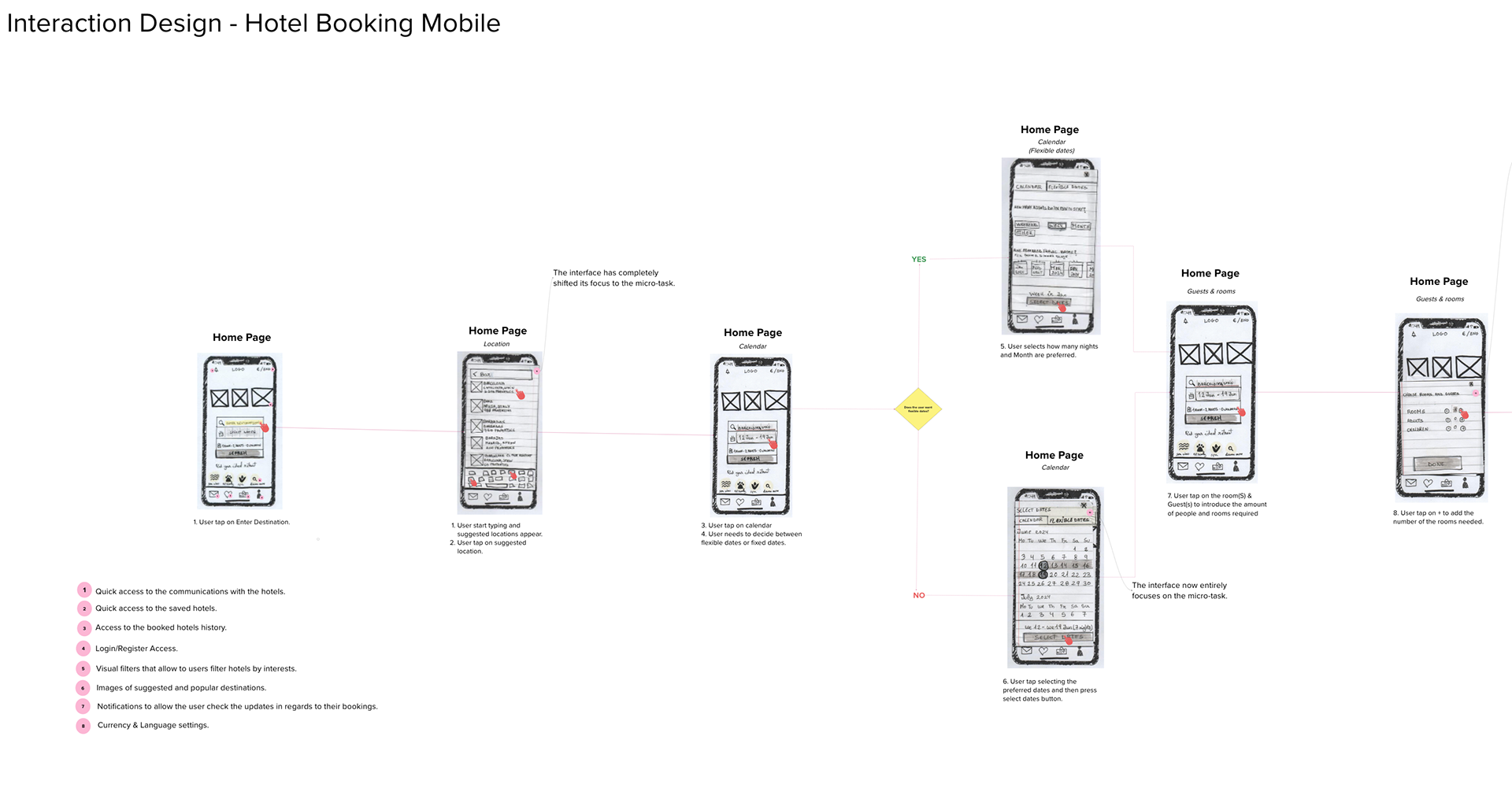
Flow Diagram
I initiated the design process by charting the 'Happy Path,' the most direct route for booking a hotel. This detailed flow diagram captured the necessary screens, variable states and specific user interactions required to complete the task.

Low-Fidelity Wireframes
I sketched low-fidelity wireframes to plan the interaction design. This low-effort approach allowed me to quickly organise ideas and identify issues early on.
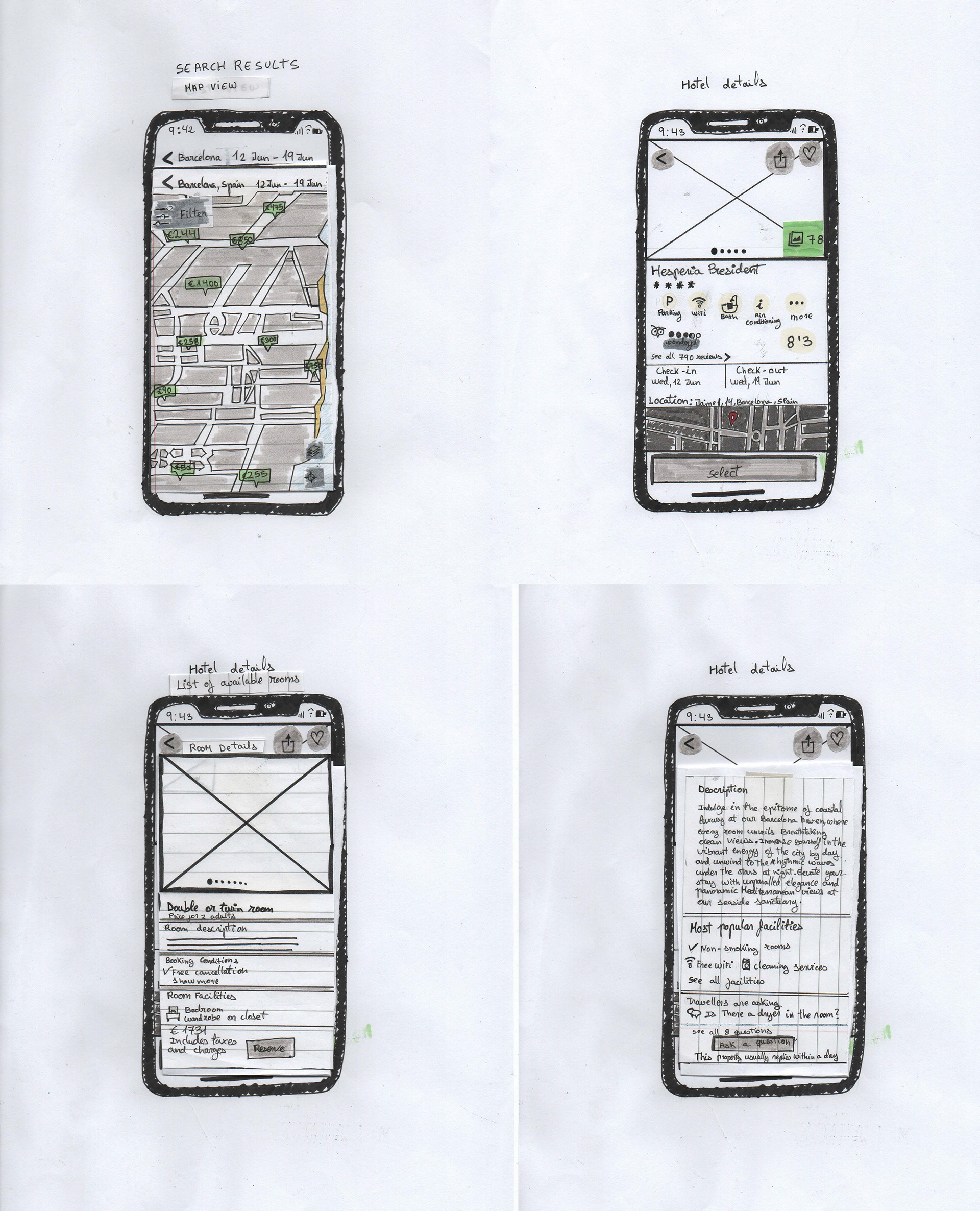
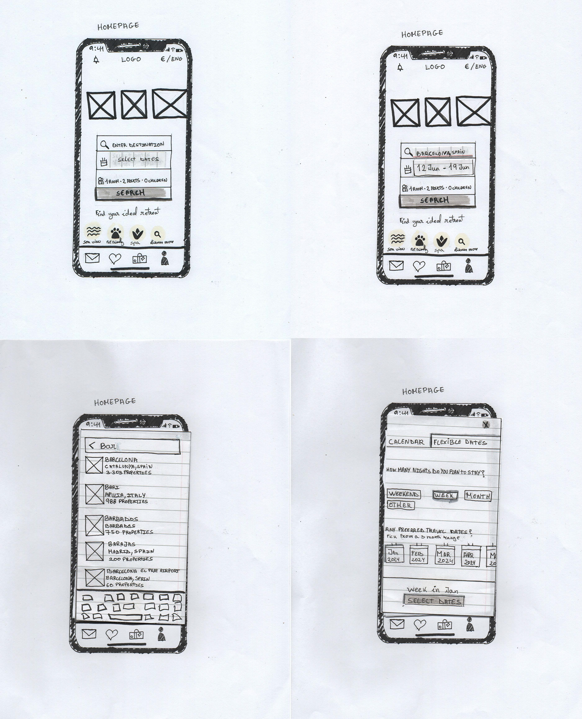
I imported these sketches into Mural to annotate the interactions, establishing a clear roadmap for building the mid-fidelity prototype in Figma.
Prototype
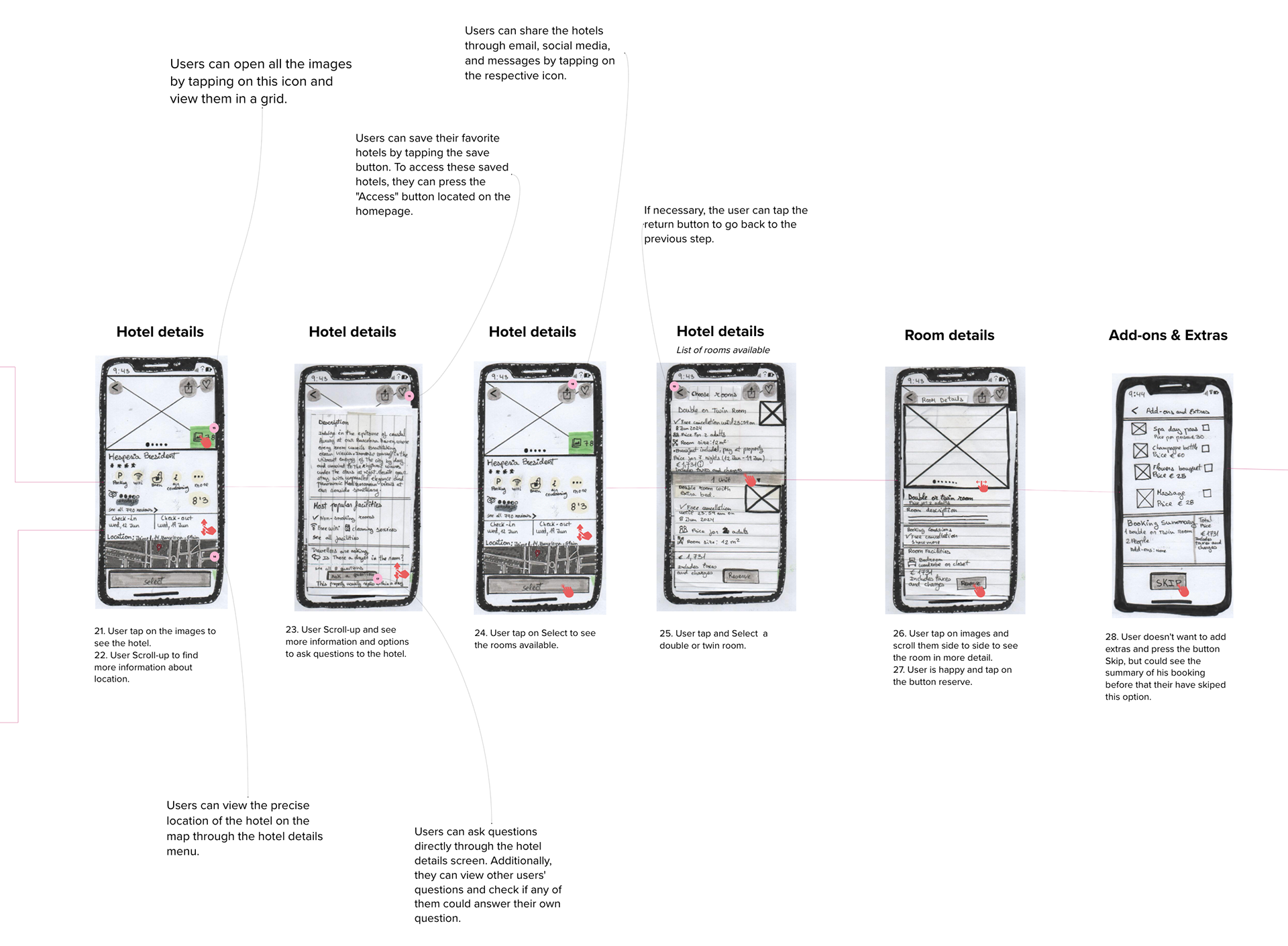
Mid-fidelity wireframes
I evolved the low-fidelity wireframes into mid-fidelity designs to build a testable prototype using Figma. This allowed me to define the typography and optimise font sizes for mobile devices. I also refined the screen layouts to ensure a clear visual hierarchy and a smooth user flow.
Annotations
Upon finalising the mid-fidelity wireframes, I annotated the designs with details on user intent, actions, and expected results. This documentation was vital for defining behaviours that weren't explicitly visual, ensuring there was no room for ambiguity.
Test
Key Takeaways
This project was a valuable experience. Given my background in Photography/Design, as well as my professional experience in recruiting, content moderation, and customer service, I found it natural to empathise with users and conduct interviews. However, conducting usability tests was particularly insightful. It highlighted how varied user experiences can be and challenged me to analyse my findings to solve real user problems.
Additionally, I learned that simply adding more features doesn't make an app more useful; in fact, it often creates friction. This gave me a deep appreciation for how thorough research and data can improve a product.
Unfortunately, further testing was not within the scope of this project as it was not moving into development. However, I would have welcomed the opportunity to test further. This would have allowed me to validate my design, detect potential errors, and fix them before pre-production.